Whether it is graphic design or a piece of writing, what makes it emotionally powerful is often what is left out rather than what is included. Or as the legendary designer Massimo Vignelli argued, “it’s the space you put between the notes that make the music.”
Actually, Vignelli isn’t the only one to take notice of how music is made in such a way. From Claude Debussy to Wolfgang Amadeus Mozart, a great many musical minds have been credited with saying something similar. And, as a (somewhat shitty) musician myself, I can say it makes a lot of sense.
After all, if one was to play Rhapsody in Blue without Gershwin’s oddly timed pauses and shifting tempo, it no longer sounds like an impassioned musical journey. Instead, it would sound like a cat walking carelessly across the keyboard — a sound anyone who has sent a six-year-old to piano lessons knows all too well.
As it turns out, notes alone aren’t what create music. Music is instead made by what’s not included — by the spaces between each beat or melodic crescendo, the beauty of simplicity and the exclusion of the unnecessary. (Oh, feel free to get sidetracked here.)
In fact, most creative work is similarly dependent on what’s excluded from its final form rather than how much meaning, narrative or messaging its creator can cram into it. This is why Earnest Hemingway’s terse prose, for example, imbue the reader with deep emotional responses despite being stunningly thin on explanatory narration.
Consider it the narrative equivalent of putting those spaces between notes.
This is often a difficult concept for clients to grasp in our modern world where information (and I really mean all information) is literally at our fingertips. There’s a profound temptation when designing an advert, writing an essay or telling a story to pack in virtually every ounce of detail imaginable — even going so far as to overexplain punchlines, grotesquely overload our audience with trivialities or simply bore them with nuance.
I’ll give you more insight into what I’m on about in a minute… but suffice it to say that I’m a big believer in leaving “space” for one’s audience to actually use their imagination, indulge their own creative impulses and become an active participant in the narrative rather than a passive spectator on the sidelines.
Such space is crucial in storytelling — whether it be fiction, advertising or design. Richard Holman describes this space as “the gap” — a disconnect or missing component that requires the intended audience to work out for themselves what an advert is trying to convey.
For an example of Holman’s philosophy at work, just consider the ad campaign Don Draper pitched to Heinz Ketchup in Season 6 of AMC’s indomitably brilliant series, Mad Men:
(It’s worth noting that the pitch didn’t end up wining over the client in the show — but it’s still a damn good advert. So good, in fact, that after the series aired the real Heinz Ketchup decided to nick the idea and bring Draper’s pitch to life.)
As I’ve written about before, this “gap” isn’t a tool needed exclusively by Mad Men trying to sell ketchup — it’s a critical component of storytelling, design and pretty much any other creative pursuit. (The lack of such a gap is precisely why so many of James Cameron’s works disgust me on a visceral level, even if his penchant for special effects is otherwise spectacular.)
I’m not exactly sure if this room for creative thought was what Vignelli was referring to when he echoed the sentiments of blues musicians, classical composers and other musical legends by drawing attention to the “space you put between the notes,” but I like to think it was.
After all, Vignelli was a mavin at leaving room for the audience to interpret his message on their own terms. His groundbreaking and modern 1963 advert for Pirelli tires, for example, was a masterclass in understatement:
Oh, sure… He could have plastered the lower third with a wordy explanation about Pirelli’s superior construction. He could have written lengthy copy about the company’s market dominance beyond the world of motorsports. His team could have even constructed a mid-60’s word salad of progressive posturing to demonstrate that even women should take note of the tire company’s excellence, because its expertise and utility goes far beyond the Mulsanne Straight of the 24 hours of Le Mans.
Instead, he simply showed a hot-pink canvas depicting a joyful young lady riding a bicycle — leaving it to you to figure out the details.
Indeed, some of the most effective designs, works of fiction and creative endeavors in the world have relied heavily on this practice of trusting its audience to “fill in the gaps.” And in so doing, these works made the audience become an active participant in bringing such ideas to life.
In advertising, design and storytelling, giving the audience this sense of participation is priceless — but to do so, it requires we allow them the freedom to take from our work what they will, without us shoving it down their throat our patronizingly holding their hand through the journey.
It’s a dedication to austerity that designers such as Vignelli often employed to make a campaign grow in the minds of those who saw it:
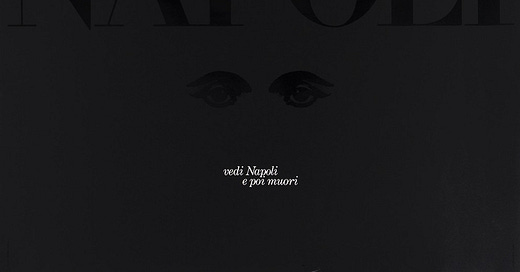
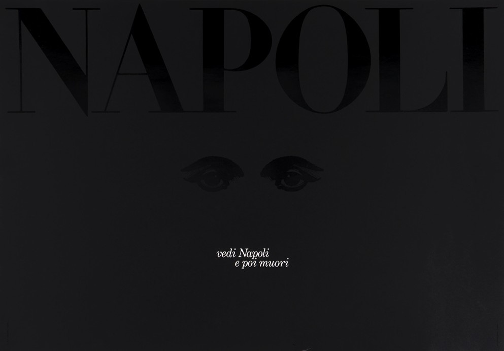
His 1986 design celebrating of the city of Naples, Italy, is perhaps the quintessential example of such minimalism.
Napoli is one of the most stunningly beautiful cities in the world, embroidered with winding cobblestone streets and latticed with a network of balconies, laundry lines and deep green flora that seem to stick to the sides of the Mediterranean architecture. With such an abundance of charm, most designers would have reached instinctually for a sweeping panorama of a piazza or an intimate photograph of some creeping strada at sunset.
Instead, Vignelli gave us a more gothic and mysterious image: A spartan black canvas with vaguely legible elements, contrasted only by the small-typed words “see Napoli, and die” — an Italian phrase that not-so-subtly suggests the Campania region’s capitol city is so naturally and artistically beautiful, one needn’t look upon anything else before shuffling off this mortal coil.
One has to imagine such a restrained visual wouldn’t be most people’s first idea for showcasing the unbridled radiance of the coastal Italian city — but it’s hard to imagine anything else would have had the same emotional, spiritual or creative appeal as Vignelli’s design. Indeed, a mere facsimile photograph of the region’s resplendence would have likely reduced the campaign to little more than a would-be postcard in a world already littered with beautiful places to admire.
And so, we’re instead beckoned with a disquiet and even superstitious asceticism — almost as if the city, itself, is daring us to test the Italian proverb by visiting it in person.
Like all good designers, storytellers and artists, Vignelli’s design here works because it relies on the imagination of the audience rather than a visual essay telling us what to think. It transforms itself from its own independent entity into something we build upon in our own mind. Like a story that forces us to think for ourselves or an artwork that sparks an emotion within the well of our being, it alchemizes itself from something we simply “see” into an idea that mulls around in the back of our own imaginings long after we’ve stopped looking at it.
And such a transformation should be considered pure magic.
When someone’s imagination is required to make sense of the world, the story we tell them suddenly becomes theirs as much as ours — leaving it to fester in their mind long after we are out of sight. Providing our audience with room for such creative thinking to take place, however, requires that we pay careful attention to the spaces we place between the notes.
After all, that’s where the music is made.
Michael Schaus is a communications and branding expert based in Las Vegas, Nevada, and founder of Schaus Creative LLC — an agency dedicated to helping organizations, businesses and activists tell their story and motivate change.